Creating an open brand for open values
Technology studio TEN7 needed their brand to be in line with their new values. While the logo stayed in place, we created a fresh face for the brand, and built a website that embodied the openness of the team.
OUR ROLE
Brand Strategy
Brand Design
Website Design
Brand
Design
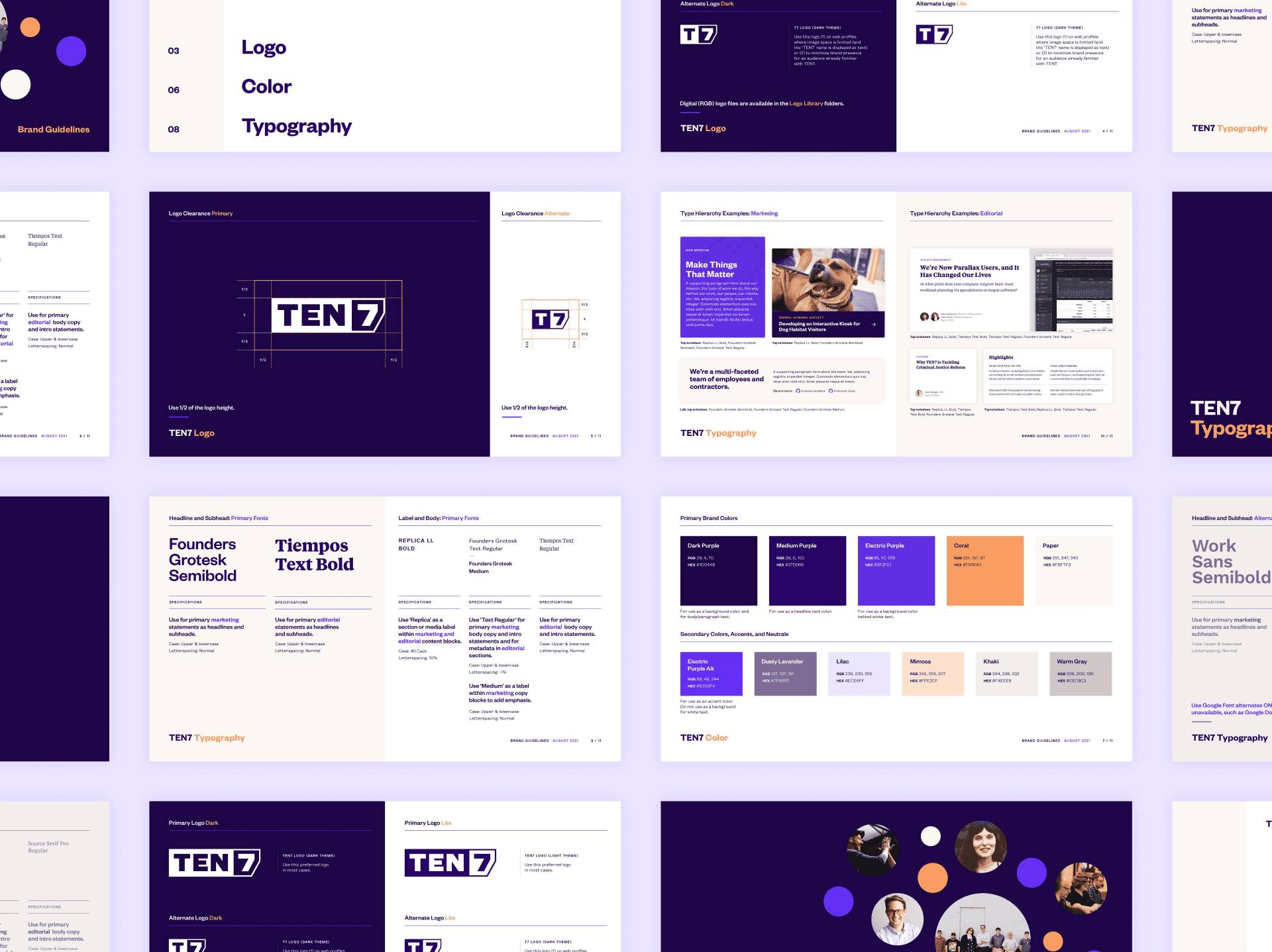
To arrive at key concepts for the brand, we first explored the client’s philosophy. TEN7’s values coalesced around mindfulness, trust, and open communication. These values naturally worked their way into a clear and welcoming visual language.
The brand strikes a balance: Authority that’s approachable, and expertise that’s kind. Every design decision goes back to this key balancing act. The logo is sharp, so the typography brings a softer and warmer feel. The contrast of purple and coral embrace two sides of the brand personality.
Teasing out a brand system was a highly collaborative, conversational process: TEN7 was keen on digging deep into their values, creating the perfect catalyst for us to develop their visuals.
Website
Design
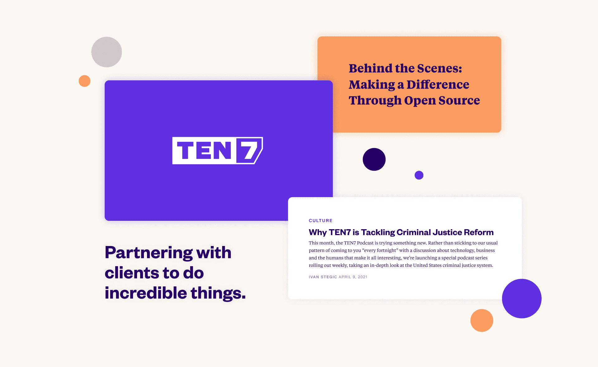
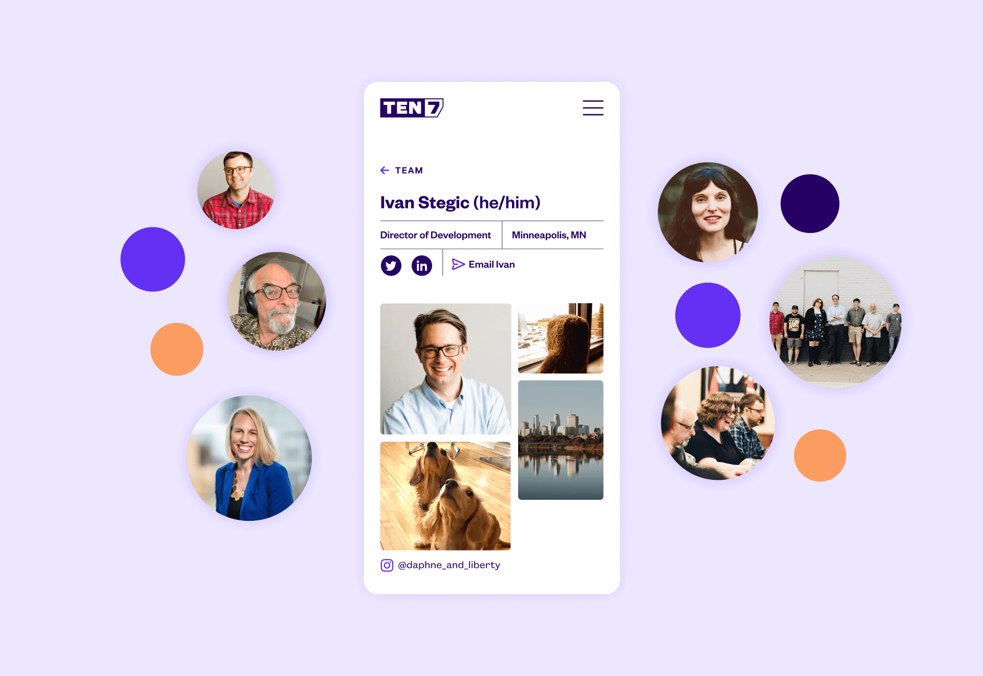
In building the new TEN7 website, we infused the warm personality of the new design system, so that the brand would help sell their services just as much as their people do. By finding small but powerful moments within the design, we gave subtle nods to the human side of things.
“
Studio Malagón led a design approach that was inclusive and responsive, and ended up taking our new site in exciting directions.
TEN7 on our collaboration
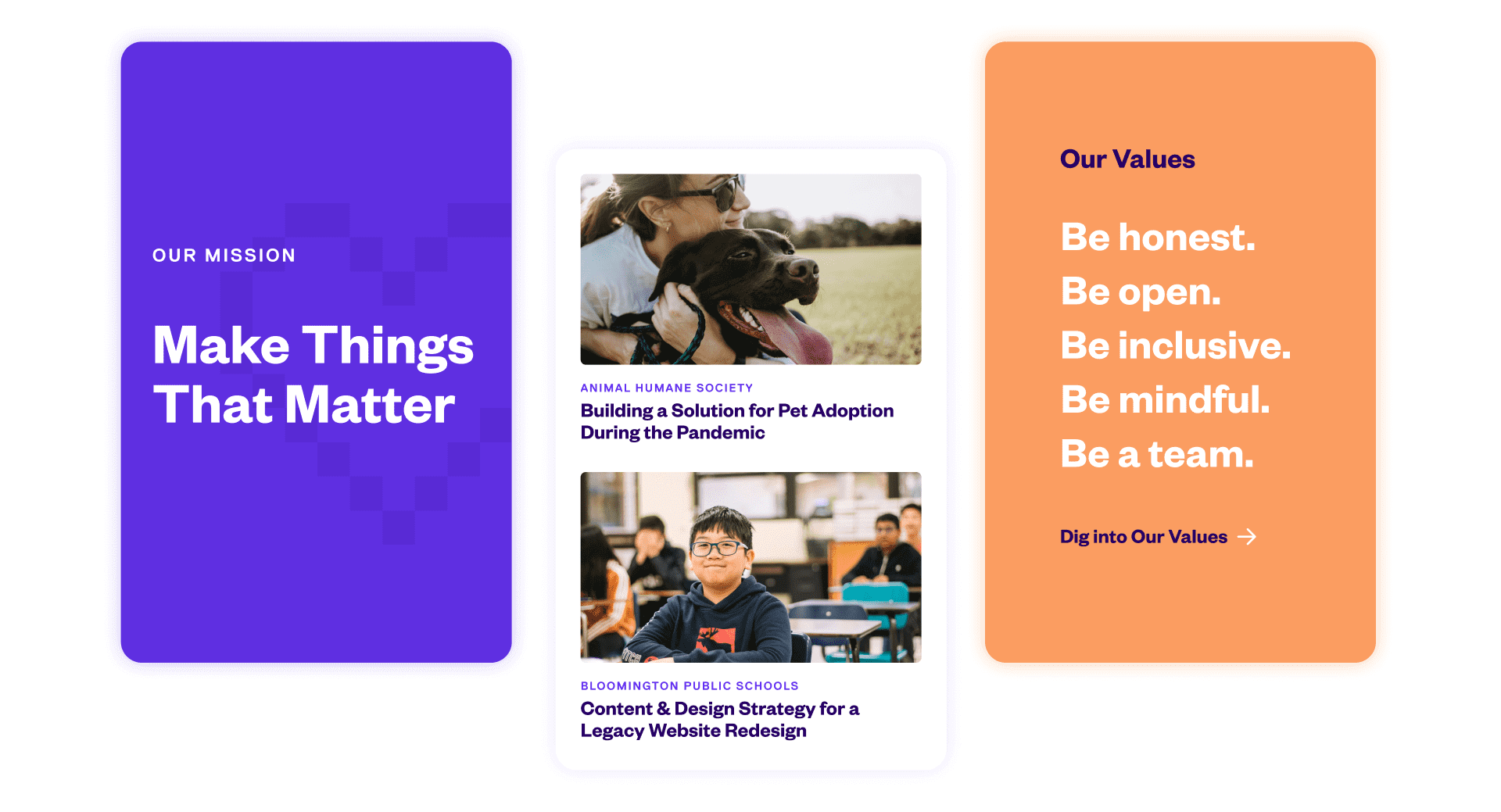
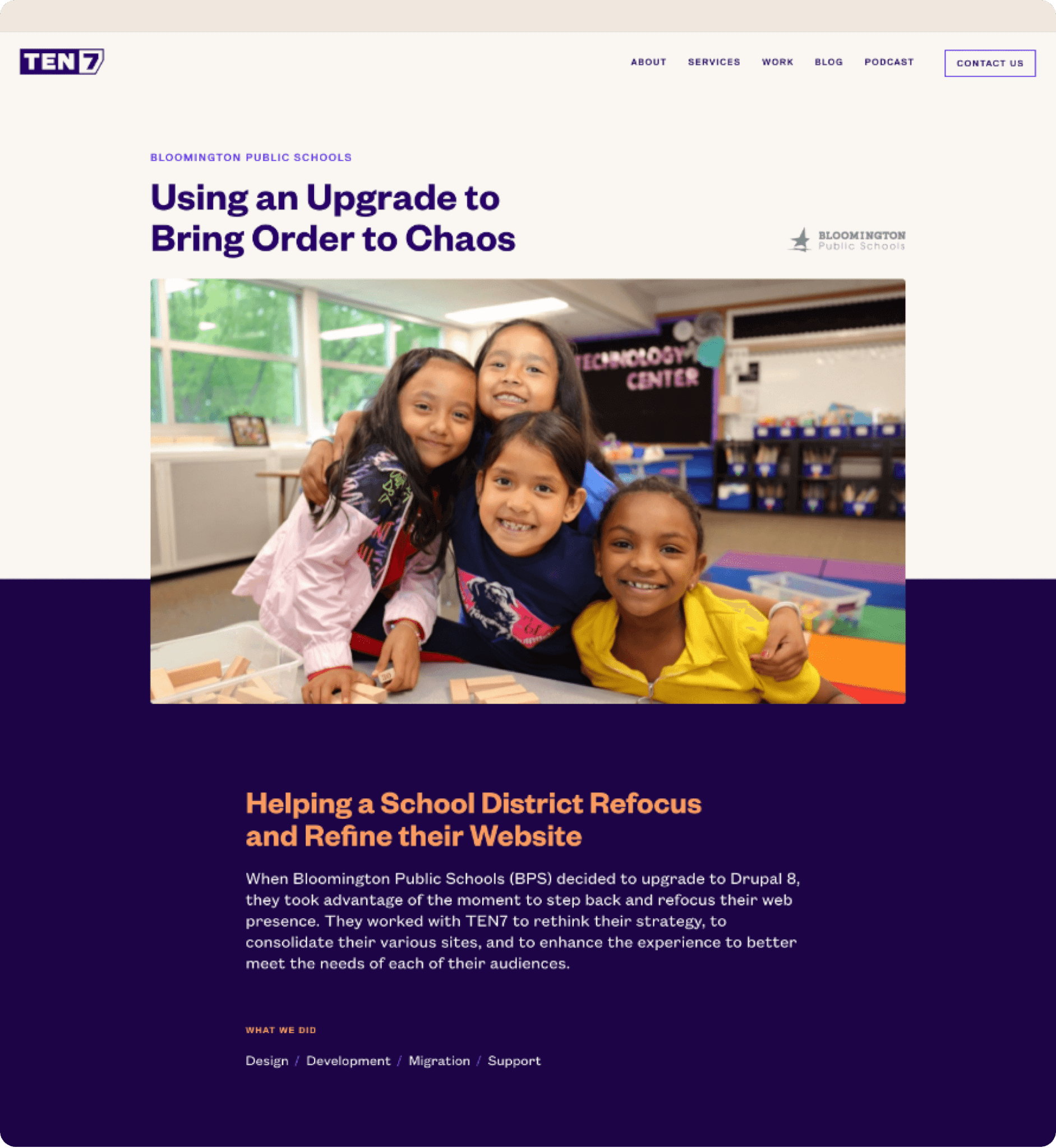
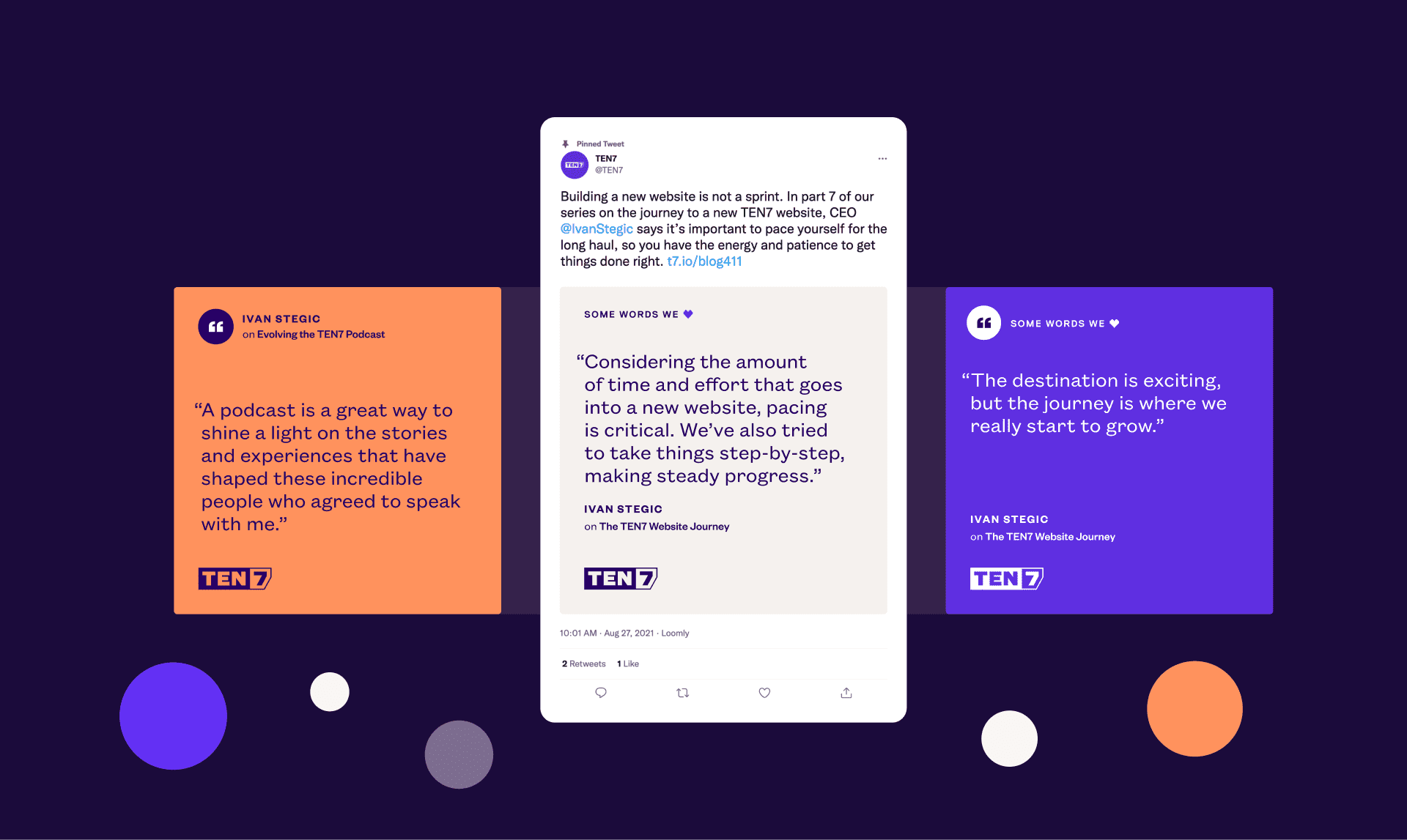
The client’s goal was never to showcase slick, finished products. It’s about celebrating the people they serve, thus featuring photographs of the real people they’ve impacted.
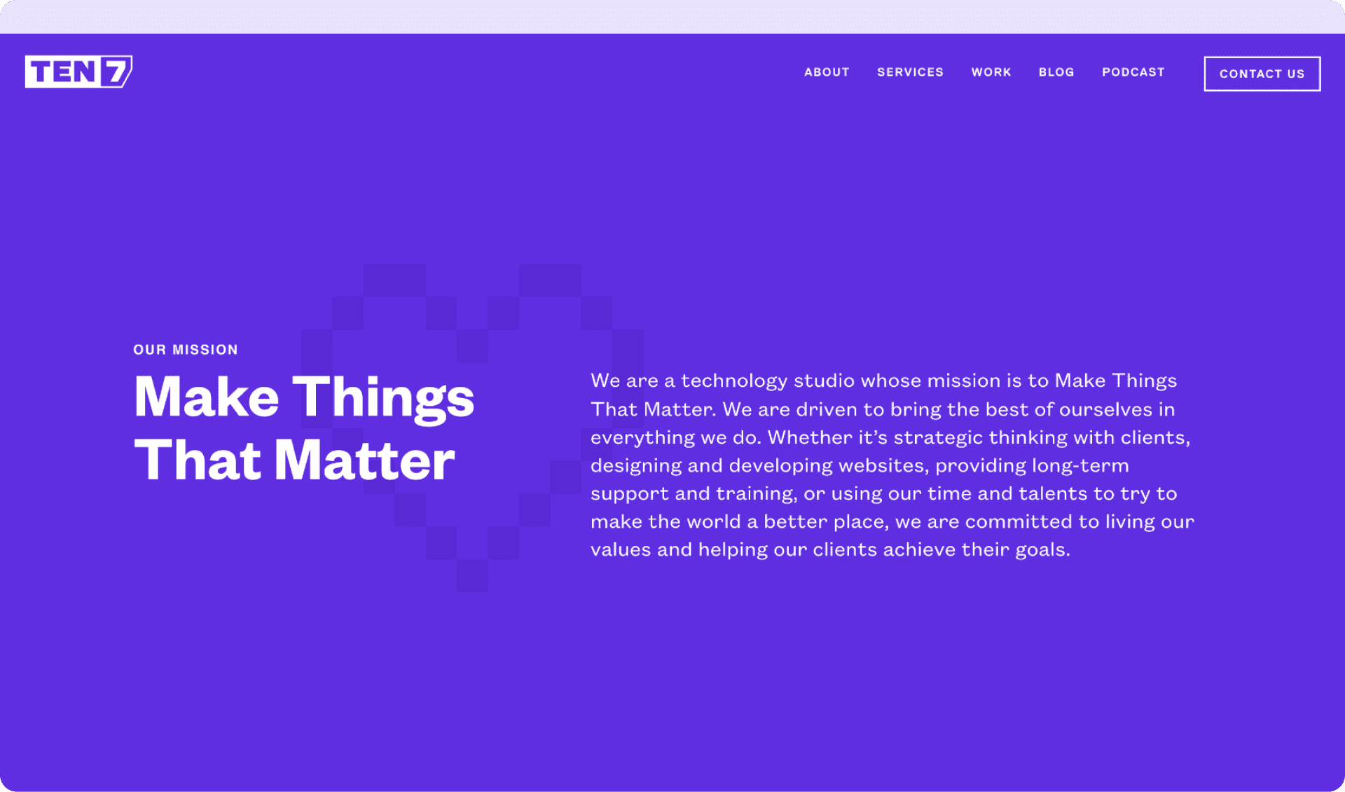
Make Things That Matter: While the client envisioned and embraced their new mission statement, we evolved their website in tandem. We let their work and their words speak for themselves.
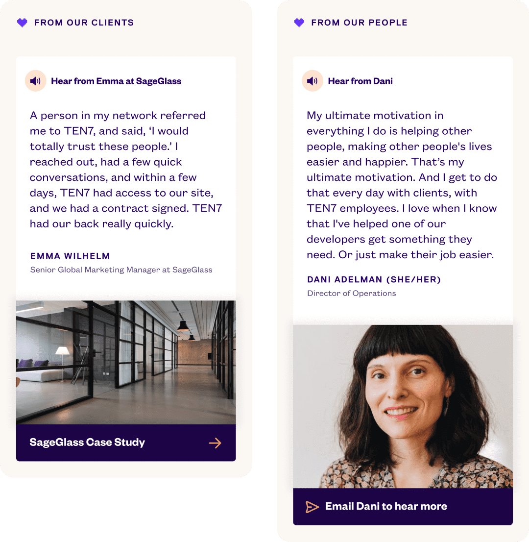

Including audio testimonials added a more accessible element that mirrors TEN7's personable approach.
In addition to their technology services, the client also has an editorial arm. For their blog and podcast, we needed a slightly different visual approach. Design details like typography made the distinctions clear, but held the entire brand together within the same visual family.
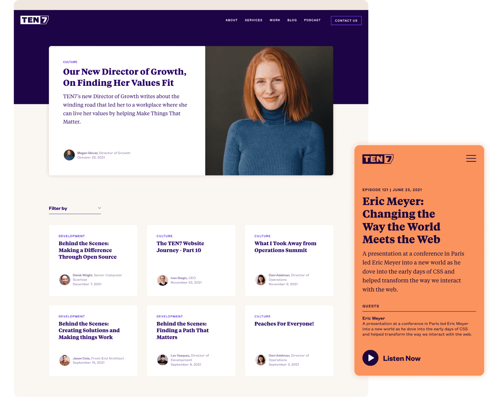
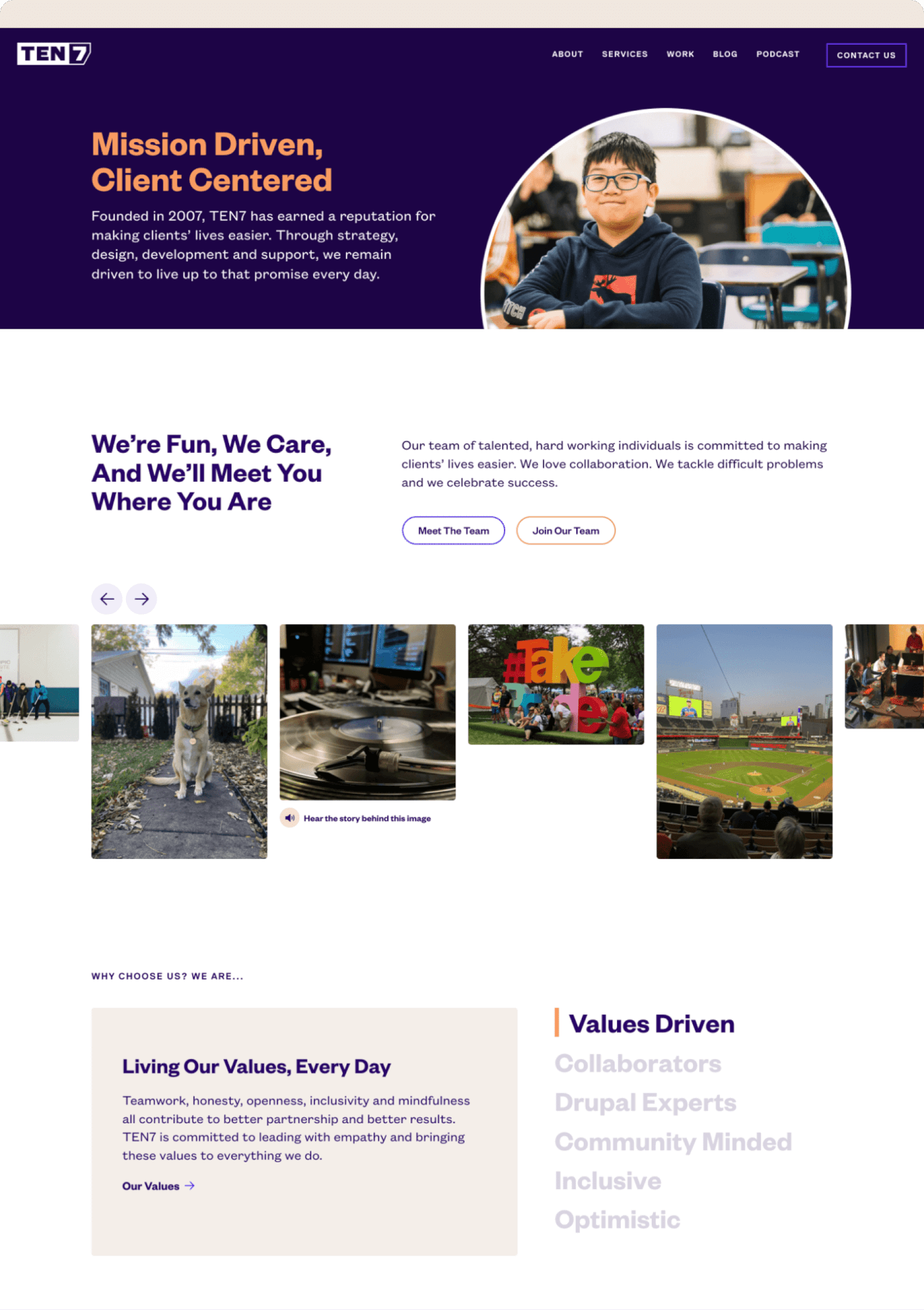
As readers scroll, the marketing content falls back to reveal the ideas-driven side of the company. This connects to TEN7’s commitment to transparency and openness.
“
Knowing we had the right people on this project, and we were all aiming toward a common goal, made the journey much more enjoyable.
TEN7 on our collaboration
Sub-Brand
Design
In conjunction with the website rollout, it made sense for the client to take a fresh new approach for their podcast. The podcast evolved alongside the new website to reflect the client’s renewed mission: to tell each of our stories with a greater impact, at a greater scale.
A podcast about technology,
business and the humans in it.

A podcast about all of us.
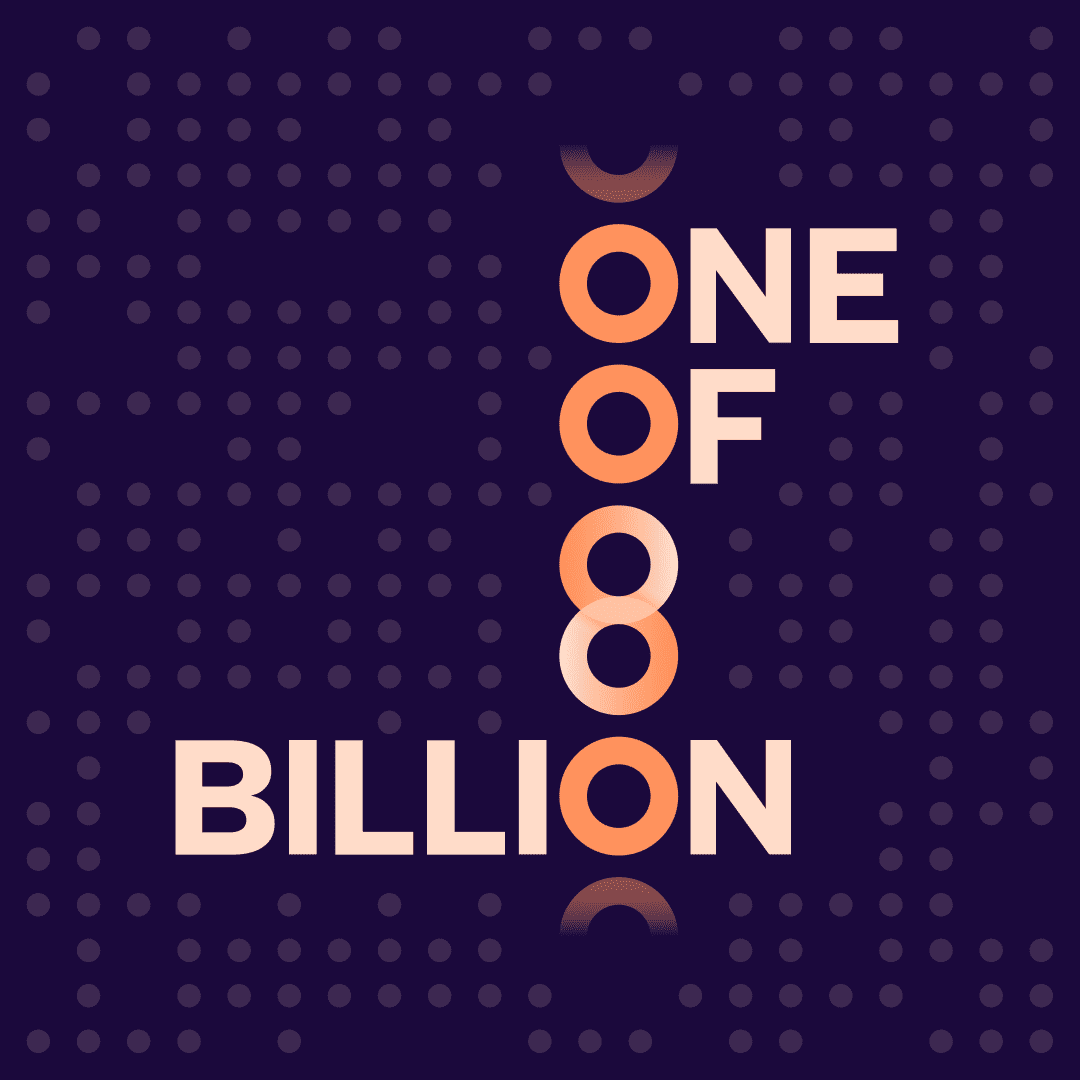
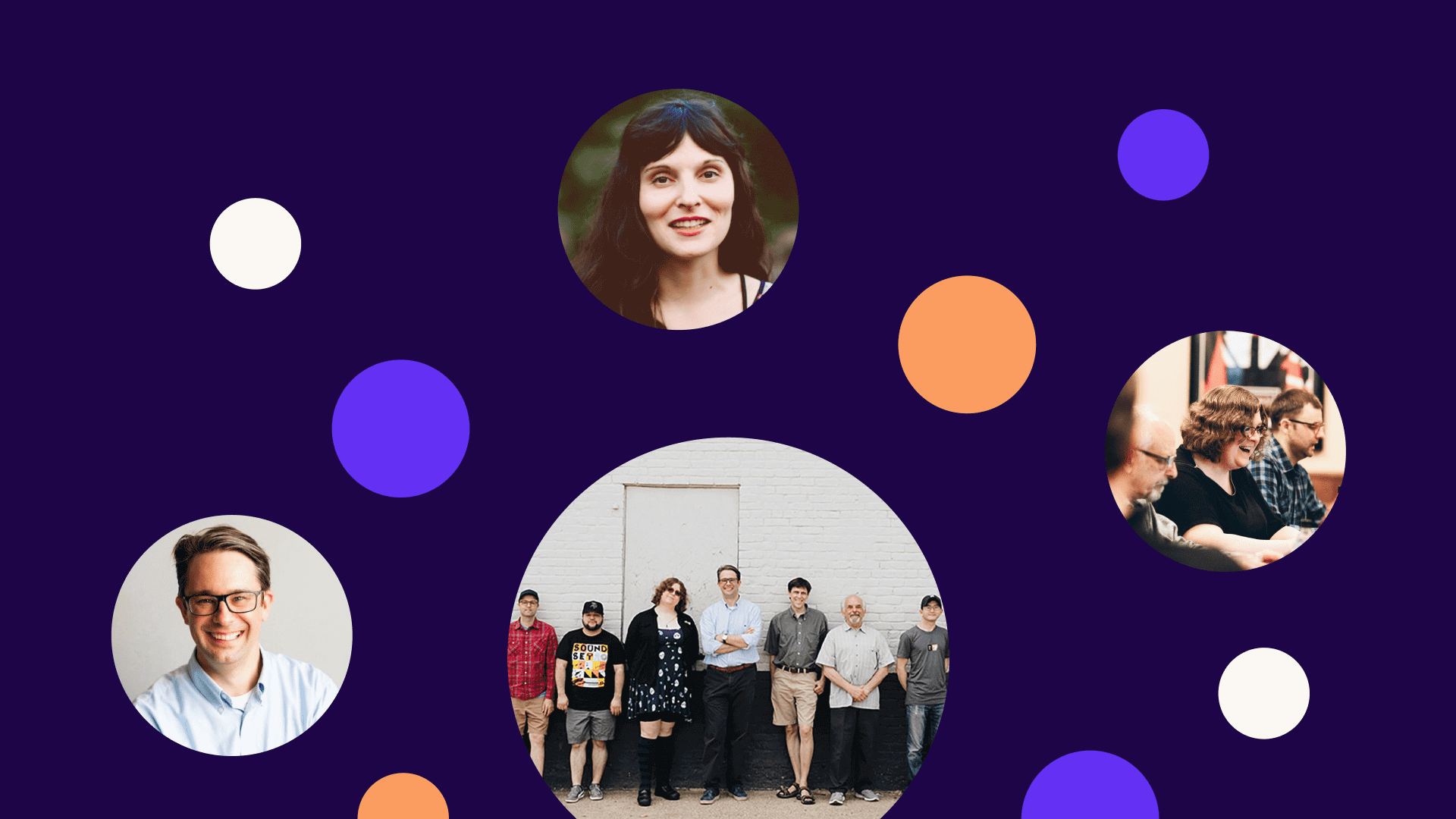
The new podcast treatment uses a scattered dot pattern, mirroring the concept of individuals among the shared network of human experience. Each of us has a story to tell, a common place among a scattering of human connections.
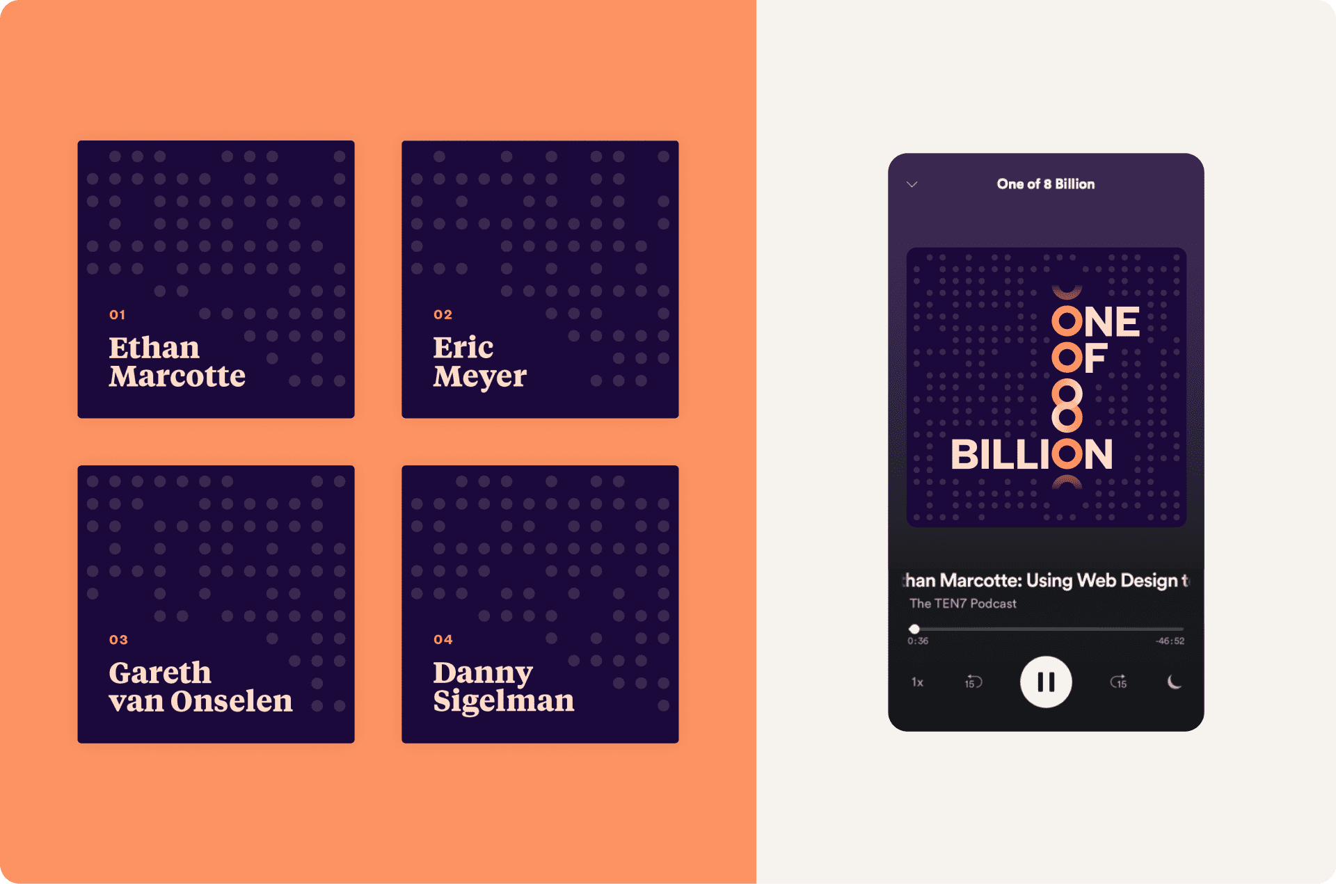
Zooming in, different podcast episodes iterate on the shared dot pattern in different ways, while episode series share common color treatments to establish their deeper relatedness. Each episode is part of a greater whole.
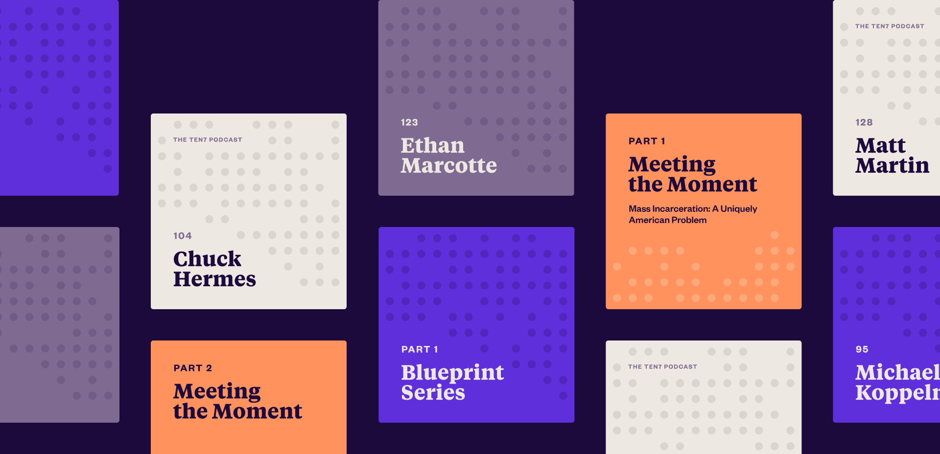
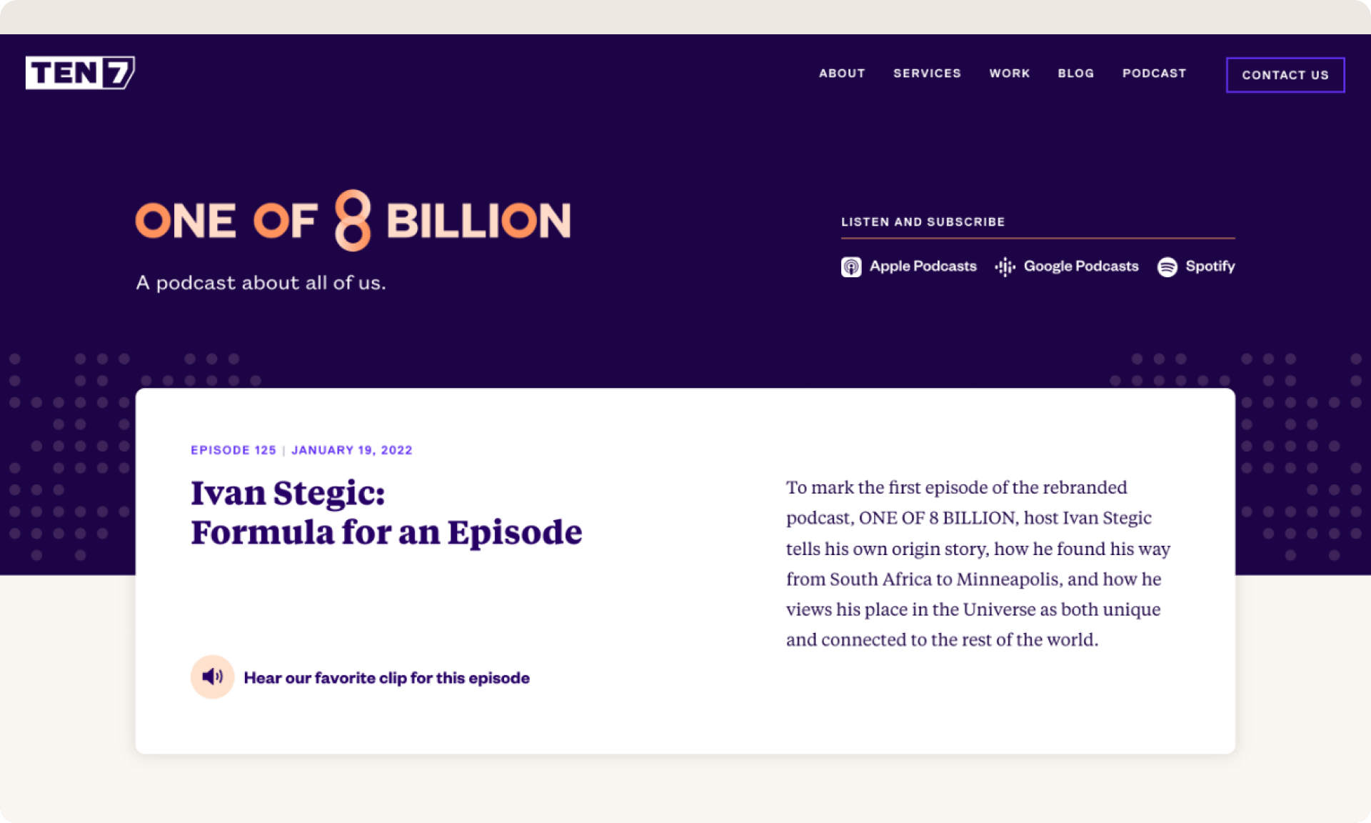
The podcast branding integrates into the main TEN7 website, fitting the sub-brand and parent brand seamlessly together as part of the same visual family. This includes a new one-line version of the podcast wordmark, against an expanded dot pattern.
Expanding outwards, each of us is a part of a greater whole. In turn, it was important to the client that each of their assets work both as standalone entities, and as recognizable components of the parent brand. Their entire rebranding and design process was an exercise in embracing that expansive quality in an inviting yet grounded way.
Want to dive deeper?

Hi, I’m Ernesto, founder of Malagon.
For 18 years, I’ve worked with growth-stage organizations solving meaningful challenges. Every project gets my direct attention—strategic clarity and creative direction without agency overhead.
Ready to talk about where you’re headed?
LinkedIn / Email / 512–766–7619
©2O26 . Malagon . Made in Austin